


What’s Wrong With This Room?
We had such a good response to our last blog post on What’s Wrong With This Room, that we decided to try and post these on a regular basis. So….here we go. Can you tell what’s wrong here?
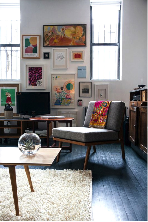
There is a lot we like about this picture, but in our opinion, the carpet is too small. We’d like to see the carpet under at least the front legs of the chair to make the chair part of the conversation area. Right now, it is visually outside the conversation grouping.
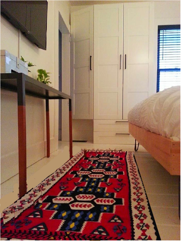
And this?
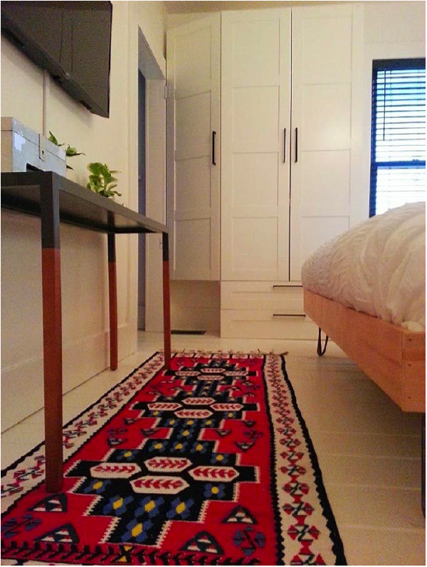
We think the carpet is too far under the console. It looks like when you walk by the end of the bed you would be walking on the edge of the carpet. I say move the carpet out and it will be more balanced.
We have used the picture below before because we feel it is a good example of a real life what’s “wrong”.
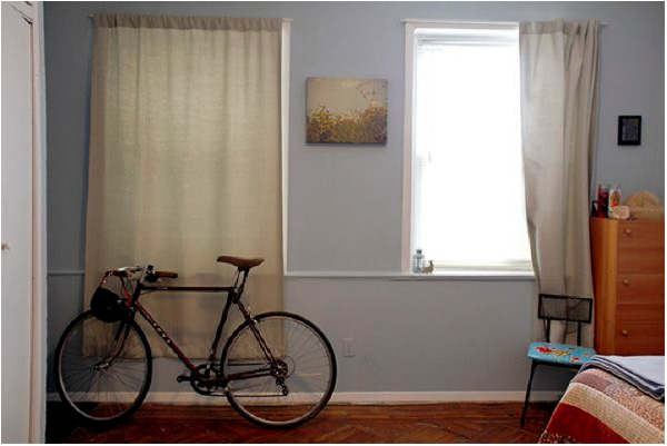
The problem with this image is that the curtains are too short. They should just skim the floor. Also, curtains are best hung above the frame of the window; ideally halfway between the top of the window and the ceiling.
There are times when this won’t work but it is a good guideline.
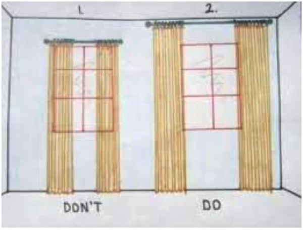
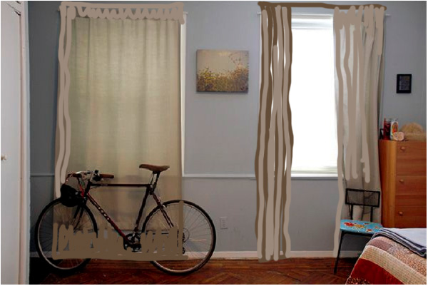
We will do a blog post specifically about curtains at a later date but this image gives you a glimpse of what to do with curtains.
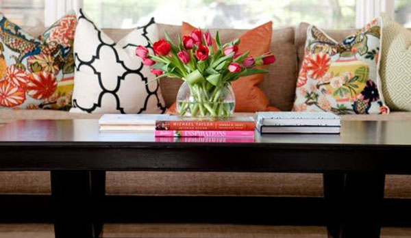
And finally, what’s wrong here?
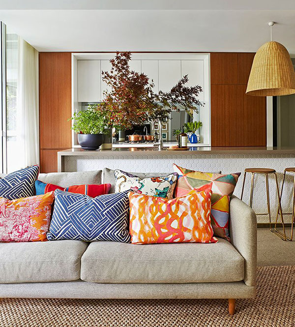
There are just too many cushions here. Having a lot of cushions can make the styling look interesting but the reality is, if there are too many cushions on the sofa they will end up on the floor when people sit down OR no one will sit there. We think three or so cushions on a sofa make it interesting and comfortable.
How about sending us an image for our game? We are always on the hunt to find new images for this series.
These images are copyrighted by their respective owners. We are showcasing them as illustrations for the content presented. Please click on the photos to be taken to the original post. We appreciate being able to use them.