What’s wrong with this Room?
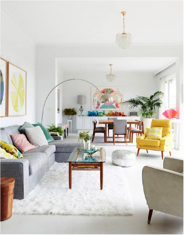
Sometimes we look at a room or a vignette and know something is not quite right. We can’t quite put our finger on it, but there is something wrong with the room. Today we are going to dissect a few images to help point out a few things that we see when we look at an image. Can you see what’s wrong with this picture?
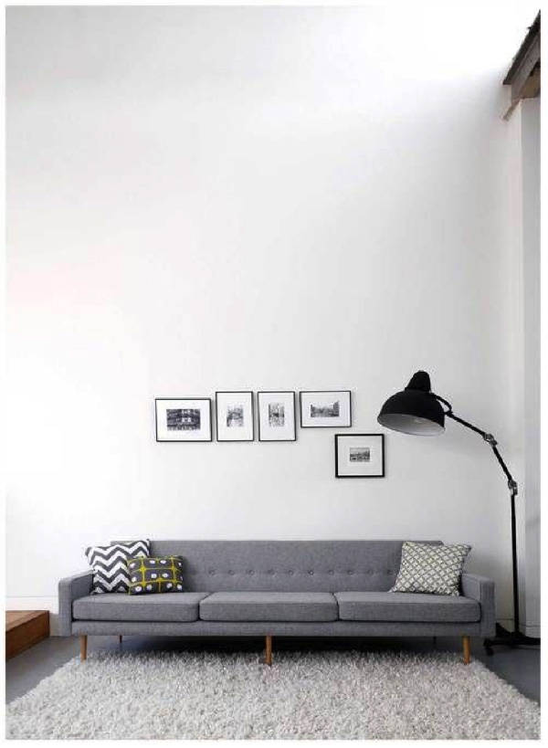
So, what do you see when you look at this photo of a room? Whether or not you like the style of these particular pieces is individual, but there is something here that no matter what the style, just doesn’t quite work. For me, it is the scale of the items in the image and the placement of the photos above the sofa.
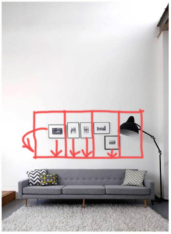
I actually really like the oversize scale of the lamp. It is quite on trend right now and is popping up in different design images these days. But, for me, the scale of the photos above the couch should also then be bigger OR more of them to make a greater impact. The combination of the large lamp and smaller artwork isn’t working for me. I would have put three larger images across the back of the sofa or put more in the grouping.
The second part that isn’t working for me is the placement of the pictures. They aren’t relating to anything right now and appear to be floating on the wall. I would like to see these images lowered significantly so they relate to the sofa. I like to have the bottom of the artwork hung 8-10” above the sofa. As another rule of thumb, it is ideal if the art is about 2/3 the width of the sofa. Most of us don’t have artwork that large which is why grouping the artwork is often done.
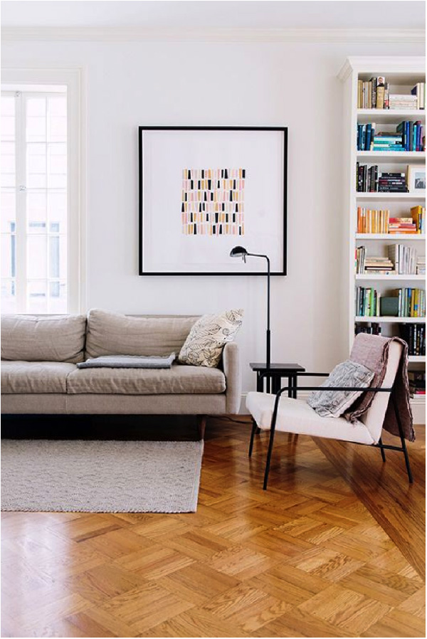
What about this image? What’s wrong with this picture?
There is a lot that is right-the bookshelves are nicely displayed, the furniture is well suited, the artwork is nice and low BUT the carpet is too small. I would like to see both pieces of furniture on the carpet. In this image it is looking like the chair is floating or an afterthought. There is no absolute rule with this-some people like all the furniture on the carpet but others are ok with just the front legs on the carpet. I definitely like it with at least the front legs on the carpet. It can get more expensive if you like all the furniture to be all the w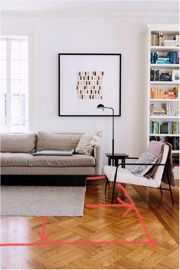 ay on the carpet but if your budget allows then it is nice if the carpet can cover a larger portion of the floor. In this particular image, it would be nice if the carpet came to just within the wood border in this room.
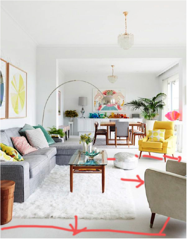
Here is another example of the carpet being too small.
The chairs on the right don’t look like they quite belong in the furniture grouping. Having the carpet extend to under the front legs of the chairs will help them belong to the seating grouping.
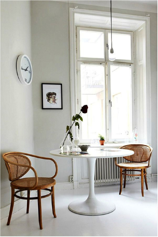
Here is another image that isn’t quite right. On first glance it looks like a beautiful serene setting but upon further assessment you can see a couple of things don’t quite work.
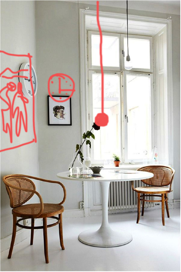
Perhaps this is a rental so the light can’t be moved but ideally the light would be above the table. So, I think moving the table to under the light might help a lot. But even if this is a rental, it would be nice to see the two art pieces in balance. There seems to be enough room on the clock wall for a larger painting or art piece. I’d love to see something substantially bigger so it becomes a real statement in the room. Then perhaps rather than the picture beside the window the clock would be better suited on this wall. This image suggests this person’s esthetic is minimalistic so perhaps just lowering the one image would be enough but I still feel a larger clock or painting is in order.
So, what we want to point out in these images is that not everything we see online and in design images works perfectly. Have a look at the photos and analyze what works for you or not. It can be fun to dissect the images and really see if it would work for you in everyday life.
If you have any images you’d like to send us on things you have found that don’t work and you’re not sure why, send them our way to info@designerscollective.ca
and we will have look.


