The Palette Project #10: The Point Blanket
This is another edition of the palette project– we’re exploring inspiring places in Canada and the colours that make them beautiful.
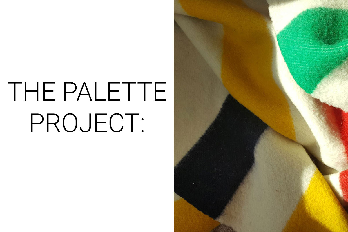
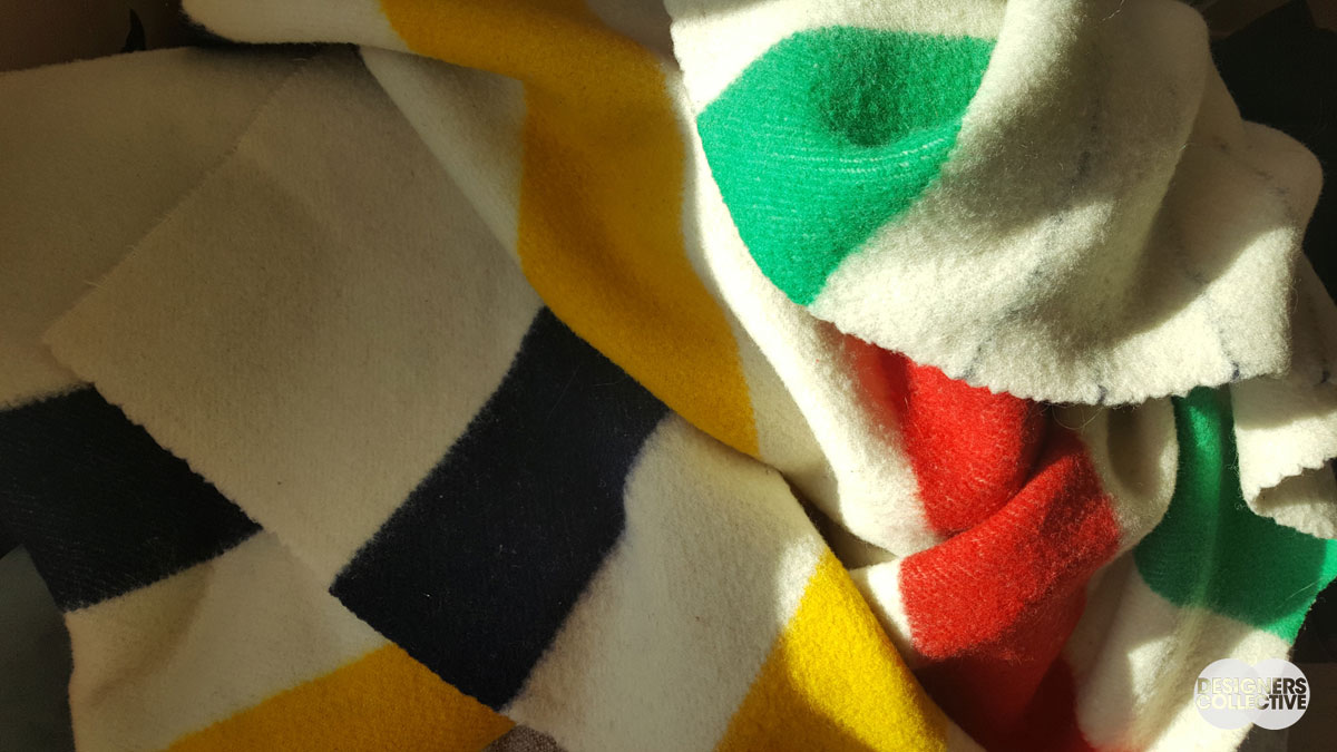
This week we’re changing gears slightly and looking at an object that is synonymous with Canadiana rather than a landscape. The Hudson’s Bay point blanket has been in production since 1780– it’s signature colour scheme of red, green, yellow, and indigo is used to this day. The ‘points’ (black lines) on the wool blankets refer to the size of the blanket so it could be easily identified when folded, a system inherited from French blanket-makers. The colours of the iconic stripes came from distinctive colour-fast dyes that were accessible in 18th century Canada. Keeping traders, families, and Canadians of all kinds warm for centuries, these blankets are an icon of Canadian heritage. Why not be inspired by it?
The Inspiration:
The Palette:
There are few colour combinations more recognizable than the yellow, green, red, and navy of the HBC. The point blanket is the classic wool blanket that has been made for generations and traded for centuries. The blankets are predominantly cream-coloured, but this time-tested palette means that we can play with proportions with confidence. A yellow couch is a bold statement, but can be tamed with accents of cream, red, and navy. A red wall may seem difficult to accessorize, but throw in some cream, green, or blue for a bright, primary-coloured space. If you are looking to spice up a cream room and natural-toned furniture, look no further than the HBC palette for a fresh mix of bold hues.
Next Sunday we’ll have new inspiration and new colours to share with you! Each of these palettes is created by Designers Collective. We encourage you to use them for inspiration! If you are interested in purchasing a palette, with paint colour identifications, get in touch with us at our studio! Email studio@designerscollective.ca or visit us at 2885 W 33rd Ave, Vancouver, BC.


